Range Filter
The Range Filter dashboard item allows you to apply filtering to other dashboard items. This item displays a chart with selection thumbs that allow you to filter out values displayed along the argument axis.
Providing Data
The Dashboard Designer allows you to bind various dashboard items to data in a virtually uniform manner.
The only difference is in the data sections that the required dashboard item has. This topic describes how to bind a Range Filter dashboard item to data in the Designer.
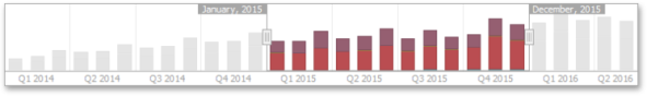
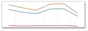
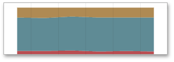
The image below shows a sample Range Filter dashboard item that is bound to data.
To bind the Range Filter dashboard item to data, drag and drop a data source field to a placeholder contained in one of the available data sections. A table below lists and describes Range Filter data sections.
|
Section |
Description |
|
Values |
Contains Data Items against which the Y-coordinates of data points are calculated. |
|
Argument |
Contains a data item that provides values displayed along the horizontal axis of the Range Filter. Filtering is performed based on these values. Note that the Option s button (the icon) allows you to create predefined ran ges used to select the required date- time interval. |
|
Series |
Contains Data Items whose values are used to create chart series. |
Series
The Range Filter dashboard item supports various Line and Area series types.
To switch between series types in the Designer, click the options button next to the required data item in the Values section. In the invoked Series Type dialog, select the required series type and click OK.

You can also do this using the buttons in the Series Type group of the Design Ribbon tab.
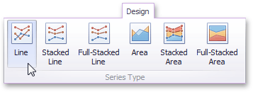
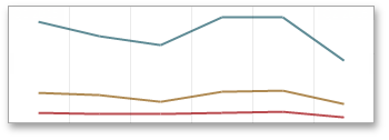
The Range Filter supports the following series types:
|
Line |
|
|
Stacked Line |
|
|
Full-Stacked Line |
|
|
Area |
|
|
Stacked Area |
|
|
Full-Stacked Area |
|
Interactivity
This document describes the features that enable interaction between the Range Filter and other dashboard items. These features include Master Filtering.
Master Filtering
The Dashboard allows you to use any data-aware dashboard item as a filter for other dashboard items (Master Filter).
Master filtering is always enabled for the Range Filter dashboard item. This Range Filter displays a chart with selection thumbs that allow you to filter out values displayed along the argument axis.

To enable filtering across data sources for the Range Filter, use the Cross-Data-Source Filtering button in the Data Ribbon tab.
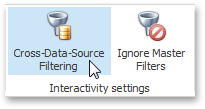
You can enable/disable ignoring of other master filter items using the Ignore Master Filters button in the Data Ribbon tab.
Predefined Ranges
The Range Filter dashboard item allows you to add a number of predefined date-time periods that can be used to perform a selection (for instance, year-to-date or quarter-to-date).
To add a period, click the Options button (the  icon) next to the Argument placeholder or use the Edit Periods button in the ribbon's Design tab. This invokes the Edit Periods dialog.

To add the selected period, use the  button or double-click this period.
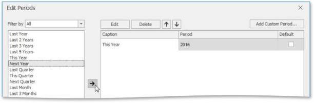
This period will be added to the right pane of the Edit Periods dialog. The following settings are available for the added period:
-
Caption: Specifies the caption corresponding to the period.
-
Period: Displays the date-time interval corresponding to the period.
-
Default: Allows you to use the selected period as the default selection in the Range Filter dashboard item.
If necessary, you can customize the selected period by clicking the Edit button in the Edit Periods dialog. This invokes the Period dialog.
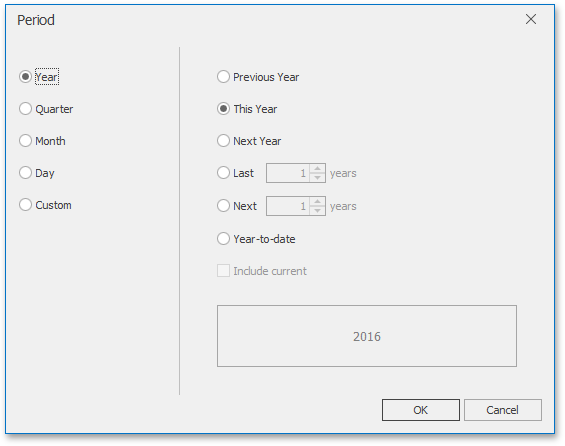
Note that the Edit dialog above contains the displayed periods (Year, Quarter, Month, Day) if the group interval of the Range Filter argument is set to Day-Month-Year.
This dialog allows you to add the following periods:
-
Year: A period duration is measured in years.
-
Previous Year: Identifies the entire previous year.
-
This Year: Identifies the entire current year.
-
Next Year: Identifies the entire next year.
-
Last Years: Identifies a specific number of previous years. Use the Include current option to specify whether or not the period is ended with the current year.
-
Next Years: Identifies a specific number of next years. Use the Include current option to specify whether or not the period is started from the current year.
-
Year-to-date: A period from the beginning of the current year and up to the current day.
-
-
Quarter: Period duration is measured in quarters.
-
Previous Quarter: Identifies the entire previous quarter.
-
This Quarter: Identifies the entire current quarter.
-
Next Quarter: Identifies the entire next quarter.
-
Last Quarters: Identifies a specific number of previous quarters. Use the Include current option to specify whether or not the period ends with the current quarter.
-
Next Quarters: Identifies a specific number of following quarters. Use the Include current option to specify whether or not the period starts from the current quarter.
-
Quarter-to-date: A period from the beginning of the current quarter and up to the current day.
-
-
Month: Period duration is measured in months.
-
Previous Month: Identifies the entire previous month.
-
This Month: Identifies the entire current month.
-
Next Month: Identifies the entire next month.
-
Last Months: Identifies a specific number of previous months. Use the Include current option to specify whether or not the period ends with the current month.
-
Next Months: Identifies a specific number of the following months. Use the Include current option to specify whether or not the period starts with the current month.
-
Month-to-date: A period from the beginning of the current month and up to the current day.
-
-
Day: Period duration is measured in days.
-
Previous Day: Identifies the entire previous day.
-
This Day: Identifies the entire current day.
-
Next Day: Identifies the entire next day.
-
Last Day: Identifies a specific number of previous days. Use the Include current option to specify whether or not the period ends with the current day.
-
Next Days: Identifies a specific number of the following days. Use the Include current option to specify whether or not the period starts with the current day.
-
-
Custom: A custom period. Allows you to specify a period with the custom boundaries
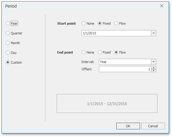
You can specify the following settings for the start/end boundaries:
-
None: The selection will begin from the start/end of the visible range.
-
Fixed: Allows you to select a specific date value using the calendar.
-
Flow: Allows you to select a relative date value. The Interval option specifies the interval between the current date and the required date. The Offset option allows you to set the number of such intervals.
Note that the Offset option can accept negative and positive values. Negative values correspond to dates before the current date, while positive values correspond to future dates.
Coloring
Certain dashboard items provide the capability to color dashboard item elements by associating dimension values/ measures and specified colors. You can choose whether to use a global color scheme to provide consistent colors for identical values or specify a local color scheme for each dashboard item.
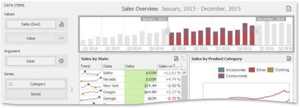
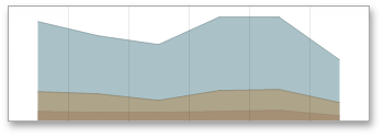
By default, the Range Filter dashboard item colors different measures and series dimensions by hue. The image below illustrates the Range Filter dashboard item whose series points corresponding to different categories are colored in different colors.

Images
The Dashboard Designer allows you to add images to a dashboard.
You can either add a static image or you can use the Bound Image as a detail item along with the Master Filtering feature.
Image Types Overview
The Dashboard Designer allows you to create two types of an Image dashboard item. The Image dashboard item allows you to add static images to a dashboard.
The Bound Image dashboard item can be bound to a set of images (for instance, stored in the database). You can use the Bound Image as a detail item along with the Master Filtering feature.
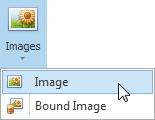
To create the required Image dashboard item, use the Images button in the Home ribbon tab.
Providing Images
Static Images
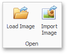
To load an image to a dashboard item, use the Load Image and Import Image buttons in the Ribbon, or commands in the context menu (Load Image and Import Image respectively).
These commands invoke the Open dialog, which allows you to locate the desired image.
The Load Image command saves the path to the image in the dashboard definition, while the Import Image command saves the image itself.
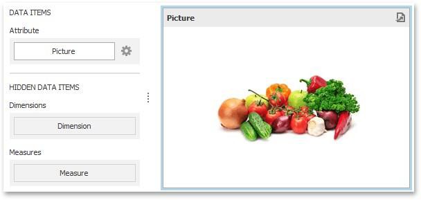
Binding the Bound Image to Data
The Bound Image dashboard item provides the Attribute data section containing the corresponding placeholder.
Specify the binding mode for the Bound Image by clicking the Options button (the icon) next to the Attribute placeholder. This invokes the following dialog:
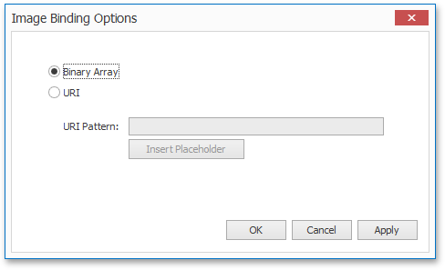
This dialog provides two options:
-
Binary Array: Use this mode if images are stored in the data source as byte arrays.
-
URI: Use this mode to locate images accessible by a predefined URI. In this case, the data source field should return strings that are parts of URIs to these images.
For instance, the URI pattern in the form below specifies the path to the folder containing the required images.
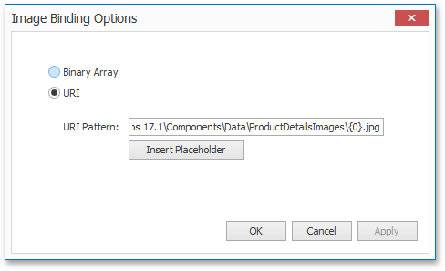
Data source field values will be inserted to the position of the {0} placeholder. Thus, the Bound Image maps the current dimension value with the image placed at the specified URI.
Note that the Bound Image can display only a single image simultaneously. If Master Filtering is not applied to the Bound Image, it selects the displayed image in the following ways:
-
In the Binary Array mode, the displayed image cannot be predicted precisely as a result of sorting limitations for the image/binary data types. Use the Master Filtering feature to display the specified image.
-
In the URI mode, the Bound Image displays an image corresponding a first attribute value taking into account the attribute's sort order.
Interactivity
This document describes the features that enable interaction between the Bound Image and other dashboard items. These features include Master Filtering.
Master Filtering
The Dashboard allows you to use most of the data-aware dashboard items as a filter for other dashboard items ( Master Filter).
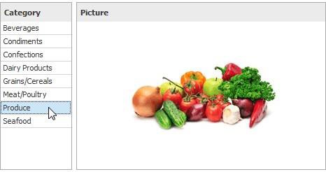
Data displayed in the Bound Image dashboard item can be filtered by other master filter items. For instance, the Bound Image below shows an image corresponding to a category selected in the Grid dashboard item.
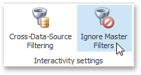
You can prevent the Bound Image from being affected by other master filter items using the Ignore Master Filters button on the Data ribbon tab.
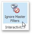
Image Settings
You can customize the representation of Image and Bound Image dashboard items in different ways.
Image Aligntment
To specify how the image is aligned within the dashboard item, use the Alignment group in the Design ribbon tab.
Image Size Mode
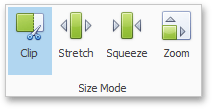
You can specify the image size mode that defines how the image fits within the dashboard item. To do this, use the Size Mode group in the Ribbon's Design tab.
The following table illustrates each size mode in two cases: when the image is smaller than the dashboard item, and vice versa.
|
Size Mode |
Image Smaller than Dashboard Item |
Image Larger than Dashboard Item |
Description |
|
Clipped |
|
|
The image is clipped if it is larger than the Image dashboard item. |
|
|
|
Stretch |
|
|
The image is stretched or shrunk to fit the size of the Image dashboard item. |
|
Squeeze |
|
|
If the dimensions of the Image dashboard item exceed those of the image it contains, the image is shown in full-size. Other wise, the image is resized to fit the dimensions of the Image dashboard item. |


|
Zoom |
|
|
The image is sized proportionally (without clipping), so that it best fits the Image dashboard item. If the aspect ratio of the Image dashboard item is the same as the aspect ratio of the image, it will be resized to fit into the Image dashboard item while maintaining its aspect ratio. Otherwise, the image will be resized in the closest fitting dimension (either the height or the width), and the remaining dimension will be resized while maintaining the image' s aspect ratio. |

Text Box
Use the Text Box dashboard item to display rich text within a dashboard.
You can either add a static text or you can use the Text Box as a detail item along with the Master Filtering or Filtering features.
Editing Text
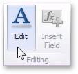
To edit the text within the Text Box, click the Edit button in the ribbon's Design tab or use the corresponding item in the context menu.
This adds the Text Box Editor context category to the Dashboard Designer's ribbon and allows you to modify the content within the Text Box.
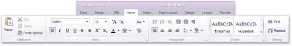
To learn how to edit the content within the Text Box, see Rich Text Editor. After you change the document, click Edit again to finish editing.
Note that the Text Box can be bound to data. To learn how to do this, see Providing Data.
Providing Data
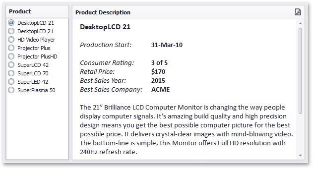
The Text Box dashboard item can be bound to data as other data-aware dashboard items. To do this, perform the following steps:
-
Drop the Name, RetailPrice and Description data source fields from the Products table to the Values section of the Text Box.
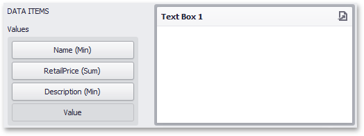
Note that summary types of the created measures are Min, Sum and Min, respectively. -
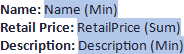
Click the Edit button in the Design ribbon tab and add the Name, RetailPrice and Description strings to the document.
-
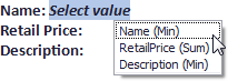
Place the pointer next to Name, right-click the document and select Insert Field (or use the Insert Field button in the ribbon). Then, click the Select value placeholder and select the Name (Min) measure.
-
Perform the third step for Retail Price and Description.
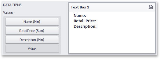
-
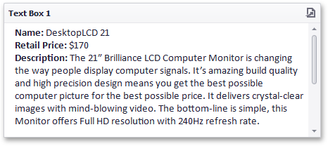
Click the Edit button again to leave the editing mode. The Text Box will show data in the following way:
You can use this Text Box as a detail item along with the Master Filtering feature to filter data according to the selected product.
Interactivity
This document describes the features that enable interaction between the Text Box and other dashboard items. These features include Master Filtering.
Master Filtering
The Dashboard allows you to use most of the data-aware dashboard items as a filter for other dashboard items (Master Filter).
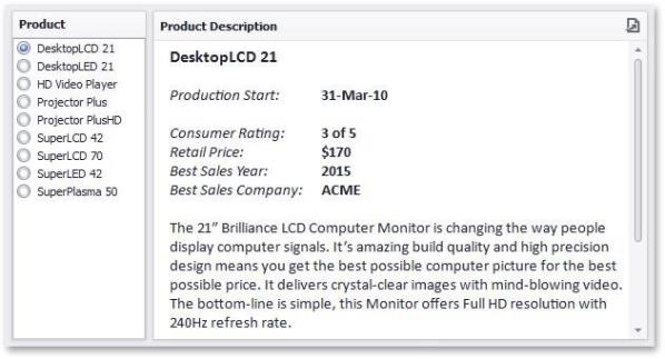
Data displayed in the Text Box dashboard item can be filtered by other master filter items. For instance, the Text Box below shows data corresponding to a product selected in the List Box dashboard item.
You can prevent the Text Box from being affected by other master filter items using the Ignore Master Filters button on the Data ribbon tab.